Usability – Mystery Buttons on Watercoolers

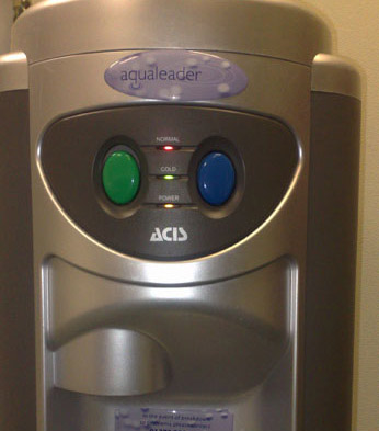
To me, usability means making sure that everything is obvious, self-explanatory and easy to use. I often see things in the physical world which make me wonder what the hell the designer was thinking. Here’s a classic example:
water-cooler1

This is one of The Werks‘ watercoolers. So, what’s the difference between the green button and the blue button? I don’t know.

Normally, blue taps signify cold water. So what about the green button? What does green signify? Is it hot? Why green?

Whichever button you press, you get cold water. So why two buttons? Why no explanation of what the buttons do? And why not stick to the convention of:

Blue = cold

Red = hot ?

This is a good example of bad usability, which leaves people with a vague sense of confusion. Obviously, giving people a sense of confusion is a bad thing.

Good web copy (and design) leaves no room for confusion.
Why you are not to blame when technology fails…

doorplateopt

Donald A. Norman makes an interesting point in his book The Design of Everyday Things – that people tend to blame themselves when technology lets them down.

How often do hear people taking the blame when the printer decides to quit? Or feeling guilty because they made the computer crash? Norman suggests we should not blame ourselves – we should blame the designer.

If something goes wrong because we haven’t used it properly, the designer clearly hasn’t designed it very well. A well designed object should be intuitive to use, removing the possibility of mistakes. I think good web design follows the same principles: it shouldn’t let you make mistakes.

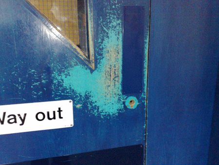
The picture above is only slightly relevant to this post – but it’s what made me think of Norman’s work. It shows a door that has been well-worn by thousands of hands pushing it open. The fact that the door has a push-plate made me think of The Design of Everyday Things. This doesn’t represent bad design – it’s just interesting that everyone chooses to push the door not by the push-plate.

So the next time you struggle to open a can of beans, or your computer decides to act up, blame the designer for letting you get it wrong.

Simple Web Design – Usability is Key

I’m a big fan of the Steve Krug approach to web design.

His popular book – Don’t Make Me Think – espouses the view that web users do not want websites that make them think. He goes so far as to say that users will be actively turned off difficult websites, clicking away without a second thought.

Web design should take this into account, making the most of conventional features and functions that people already understand.

Conventions such as:

  • Links are blue, changing colour after you click them
  • A list of links runs down the left hand side of each page
  • The logo is also a clickable link to the home page

It seems obvious to me that web design should make website use as easy as possible.

Why challenge your users?

After years of web use I know that some web designers have other things in mind. Web designers may want to impress their peers with the latest technology, flashy graphics or unconventional layouts.

Sadly, ground-breaking formats and novel structures may mean a learning process for a user who doesn’t want to learn.

Make it Easy on Your User

Functional sites, designed with usability at the fore, can be beautiful in their simplicity.

Rather than forcing your users to struggle through something new, work with what web users already know.

Simple, Common Sense Copy

My approach to copywriting follows the ideas of Steve Krug. I want people to use the websites I work on and I want them to find them simple to understand.

The easier my copy is to read, the more likely your users will buy, register or understand the message.

(Thanks to Andy Budd of Clearleft for the book recommendation!)

Let’s chat about your projectContact us